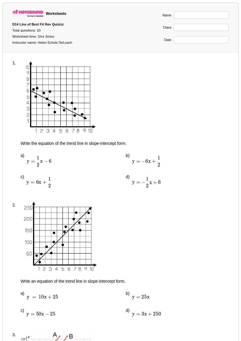
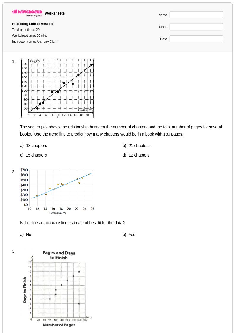
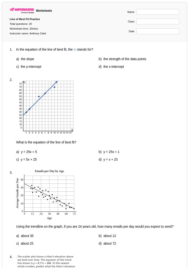
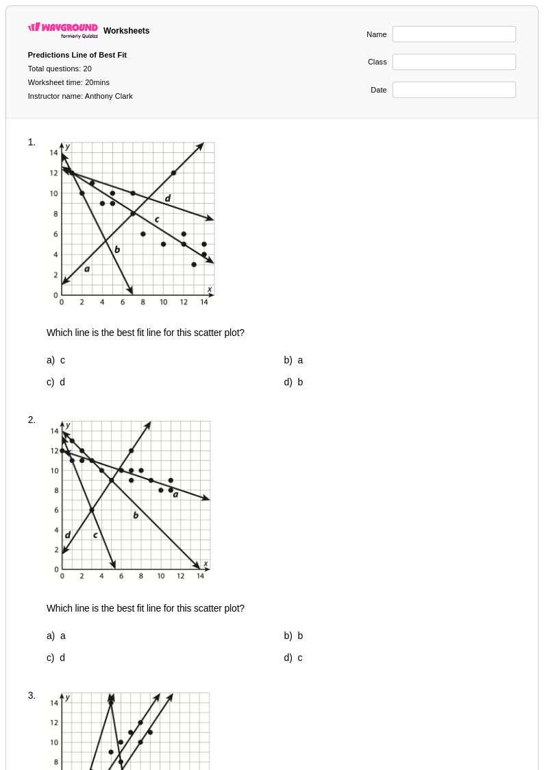
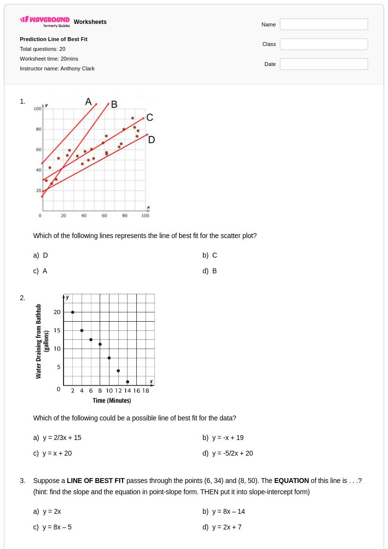
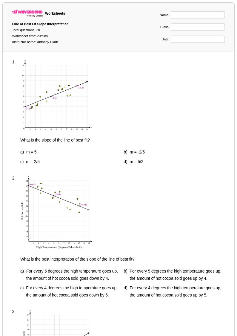
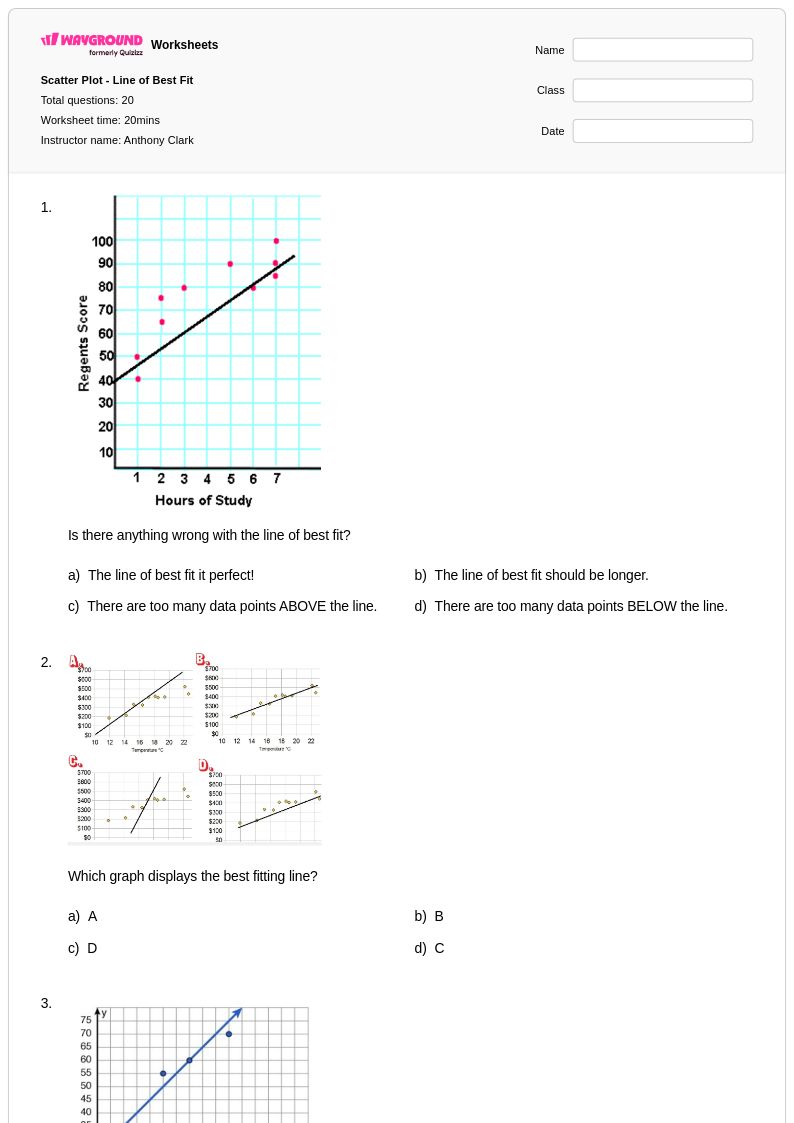
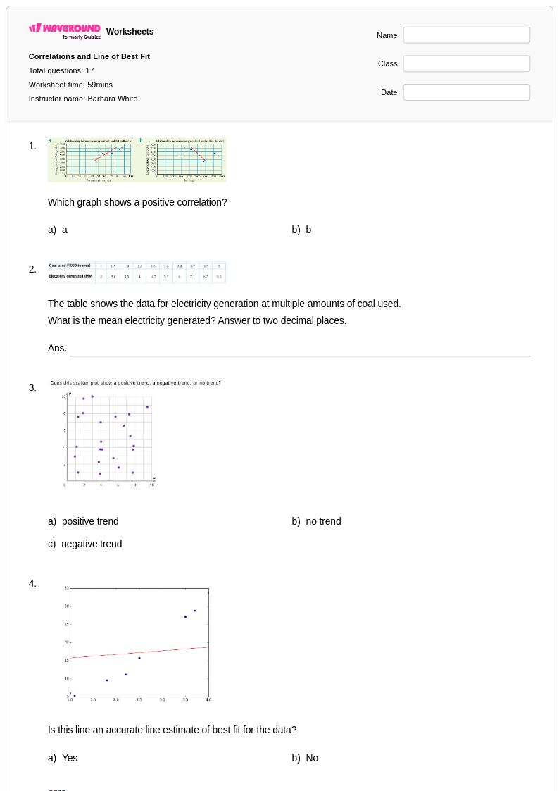
Master line of best fit concepts with Wayground's comprehensive collection of free worksheets, featuring printable PDFs with practice problems and answer keys to help students analyze data trends and make predictions.
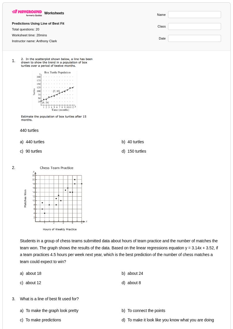
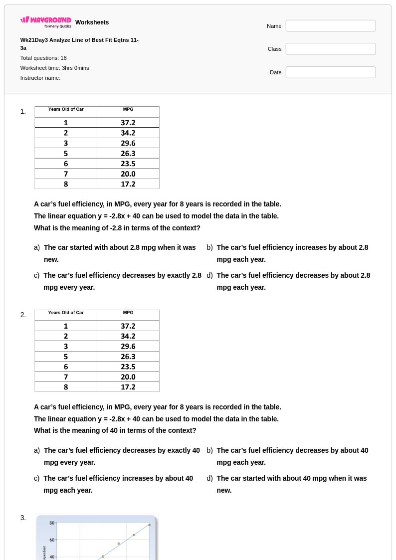
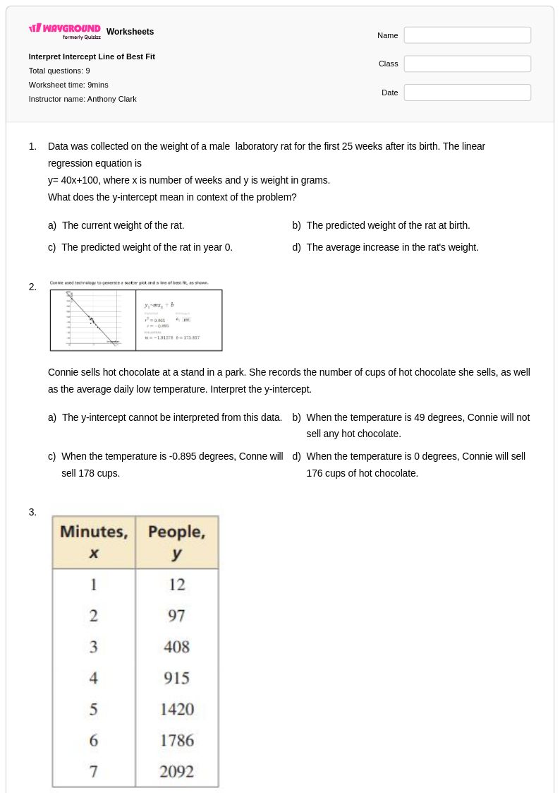
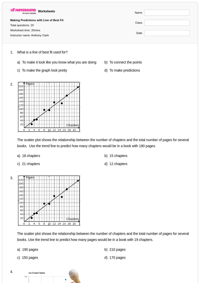
Line of best fit worksheets available through Wayground (formerly Quizizz) provide comprehensive practice for students learning to analyze scatter plots and determine linear relationships in data sets. These mathematics resources focus on developing critical skills in creating trend lines, calculating correlation coefficients, interpreting slope and y-intercept values, and making predictions based on linear models. Students work through practice problems that range from plotting points and drawing approximate lines of best fit by hand to using statistical methods for determining precise equations. Each worksheet includes detailed answer keys that guide students through the step-by-step process of analyzing data relationships, while free printable pdf formats ensure accessibility for classroom and independent study use.
Wayground (formerly Quizizz) supports mathematics educators with an extensive collection of millions of teacher-created line of best fit resources that streamline lesson planning and skill development. The platform's advanced search and filtering capabilities allow teachers to locate worksheets aligned with specific curriculum standards, while differentiation tools enable customization based on individual student needs and proficiency levels. Teachers can access materials in both printable and digital pdf formats, making it easy to implement targeted remediation for students struggling with correlation concepts or provide enrichment activities for advanced learners ready to explore multiple regression analysis. These flexible resources support varied instructional approaches, from guided practice sessions to independent skill-building exercises, ensuring students develop strong foundational understanding of statistical relationship analysis.
FAQs
How do I teach the line of best fit?
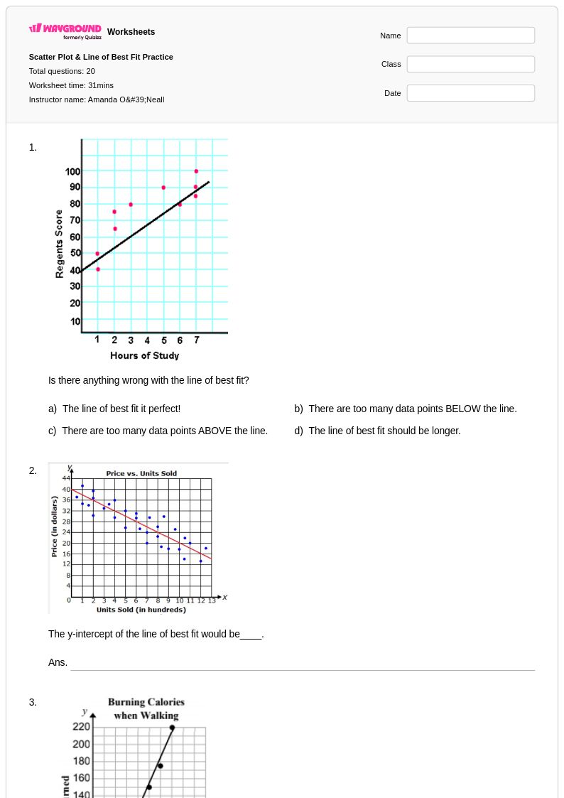
Start with real-world data sets that students find relatable, like the relationship between hours studied and test scores. Have them create a scatter plot first. Then, introduce the concept of a 'trend line' by asking them to lay a piece of spaghetti or a clear ruler over the data to show the general pattern. The goal is to find a line that has roughly the same number of points above and below it, capturing the central trend of the data.
What skills do these line of best fit worksheets practice?
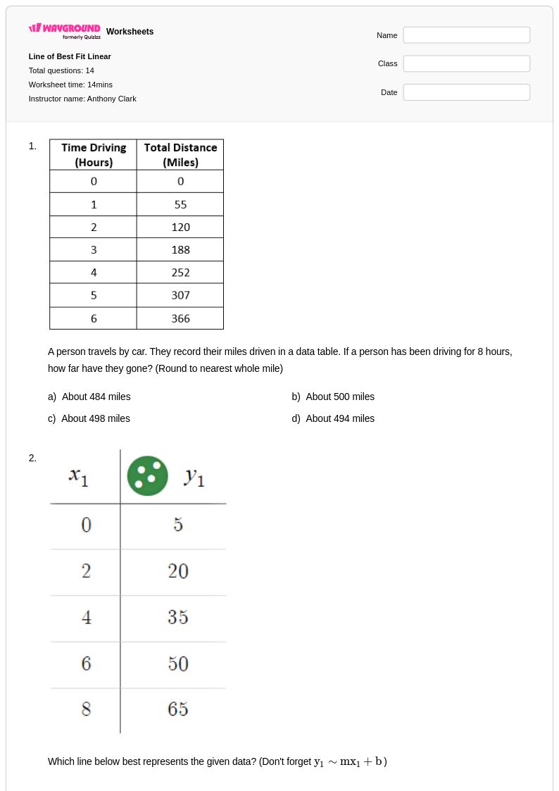
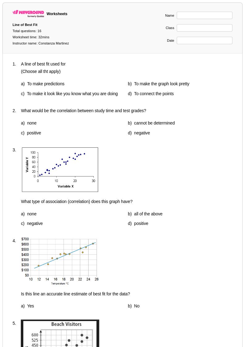
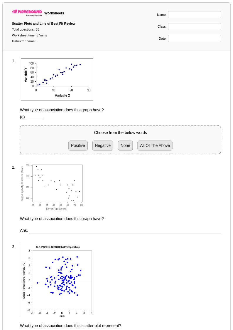
These worksheets provide practice on the core skills of analyzing scatter plots. Students will work on drawing an appropriate line of best fit, interpreting the meaning of its slope and y-intercept in context, and using the line to make predictions for new data points.
What are common student mistakes with the line of best fit?
A frequent error is forcing the line to go through the origin (0,0), even when the data trend doesn't support it. Students may also draw a line that connects the first and last points rather than one that represents the overall cluster. Another common misconception is confusing correlation with causation, assuming that because two variables are related, one must cause the other.
How do I use this Wayground worksheet with my class?
You can assign this worksheet in two ways to fit your classroom needs. Host it as a digital activity on Wayground, where students can complete it online, or download the printable PDF for offline practice. Every worksheet includes a complete answer key for efficient grading. For paper assignments, you can use the Wayground for Teachers app to quickly scan and grade student work.
How does the line of best fit fit into the math curriculum?
Aligned with Common Core principles, this topic progresses from informal to formal analysis. In middle school (around 8th grade), students learn to informally fit a straight line to a scatter plot by eye. In high school Algebra and Statistics, they build on this by learning to calculate the equation for the line of best fit, often using technology, and formally interpret the correlation coefficient.
How can I differentiate this topic for diverse learners?
For students who struggle with the visual-spatial aspect, start with data that has a very strong, clear correlation. On Wayground, you can use the 'Reduced answer choices' feature for multiple-choice questions about interpretation to lower cognitive load. For printable versions, adjusting the font size and spacing can also improve readability and help students focus on the data.