
 Worksheets
Interpreting Graphs
Total questions: 65
Worksheet time: 3hrs 18mins


This is a velocity-time graph. What is the object doing in segment C?
Positive acceleration
Negative acceleration
Constant Velocity
Not moving


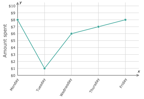
How much money was spent on Thursday?
1
6
7
8
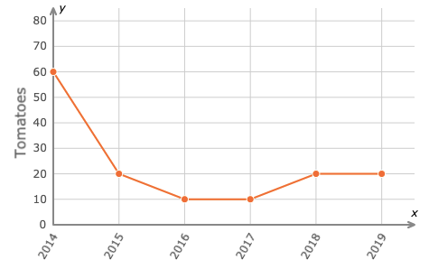
What years were 10 tomatoes grown?
2016
2017
2018
2019


The graph shows the relationship between pressure and the depth in the earth's layers as rock is formed. Which statement summarizes the cause-and-effect relationship that the graph shows?
As the amount of pressure increases, the depth decreases
As the amount of pressure decreases, the deph increases
As the amount of pressure increases, the depth increases
As the amount of pressure decreases, the depth remains the same



What do the two axes of this bar graph represent?
The x-axis represents temperature, and the y-axis represents wind speed of tornadoes.
The x-axis represents cities, and the y-axis represents average number of people injured.
The x-axis represents cities, and the y-axis represents average numbers of tornadoes.

What do the two axes of this bar graph represent?
The x-axis represents month, and the y-axis represents wind speed of tornadoes.
The x-axis represents cities, and the y-axis represents average number of people injured.
The x-axis represents month, and the y-axis represents average numbers of tornadoes.

What do the two axes of this bar graph represent?
The x-axis represents temperature, and the y-axis represents wind speed of tornadoes.
The x-axis represents cities, and the y-axis represents average number of people injured.
The x-axis represents cities, and the y-axis represents average numbers of tornadoes.
What do the two axes of this bar graph represent?
The x-axis represents month, and the y-axis represents wind speed of tornadoes.
The x-axis represents cities, and the y-axis represents average number of people injured.
The x-axis represents month, and the y-axis represents average numbers of tornadoes.
Which provides the best explanation for the different types of graphs: bar, line, and circle.?
Bar graphs are best for comparing values. Line graphs are best for showing changes over time. Circle graphs are best for showing percentages of a population.
Bar graphs are best for showing changes over time. Line graphs are best for showing percentages of a population. Circle graphs are best for showing comparisons.
Bar graphs are best for showing percentages of a population. Line graphs are best for showing changes over time. Circle graphs are best for showing comparisons.
What is the advantage of displaying data in a graph rather than just listing data in a table?
A graph is more interesting to create.
A graph gives a visual representation of the data.
Graphs and data tables are very similar.
In a scatter plot, which axes are used for the independent and dependent variables.
X axis or vertical axis, is used for the dependent variable and the Y axis or horizontal axis is used for the independent variable.
X axis or horizontal axis, is used for the dependent variable and the Y axis or vertical axis is used for the independent variable.
X axis or horizontal axis, is used for the independent variable and the Y axis or vertical axis is used for the dependent variable.

Which type of graph is best to display the data shown?
bar graph
line graph
circle graph
scatter plot

Which type of graph would be best to display the data in the table shown?
bar graph
line graph
circle graph
scatter plot

Which type of graph would be best to display the data in the table shown?
bar graph
line graph
circle graph
scatter plot

What is the best explanation about the relationship between Dew Point and Pressure?
There is no relationship between air pressure and dew point.
Increasing the Air Pressure appears to cause the Dew Point to decrease.
As dew point increases the air pressure decreases.
The Dew Point and Air Pressure are strongly related.

What is the center of the data?
200
100
90
140


46, 40, 23, 29, 50, 45, 30
46, 40, 23, 39, 52, 45, 30
46, 38, 23, 39, 50, 45, 30
46, 40, 23, 39, 50, 45, 30

The graph shows how employees at Disney World travel to work. How many employees ride bikes, ride the bus, or walk to work?
300
450
325
375


The range of the data is 9 years.
The center of the data is 16 years.
The youngest gymnast is 12 years old.
The oldest gymnast is 19 years old.

Katie is reading a 200-page book that is divided into 5 chapters. The bar graph shows the number of pages in each chapter.
50% of the pages is in even-numbered chapters?
True
False


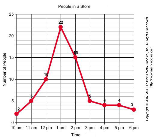
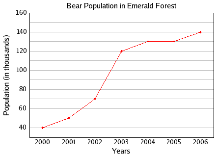


According to this graph, for every 24 hours, about how many hours are spent watching TV?
0 hours
5 hours
13 hours
3 hours

How many eggs were measured altogether in this experiment?
25
40
90
100
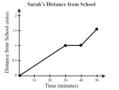
What is happening in the graph between 30 and 40 minutes?
Sarah is accelerating
Sarah is not moving
Sarah is slowing down
Sarah is travelling at a constant speed
Which statement below accurately represents the graph?
$100 is earned for each hour worked
$100 is earned for every 2 hours worked
$500 is earned for every 8 hours worked
$200 is earned for every 3 hours worked
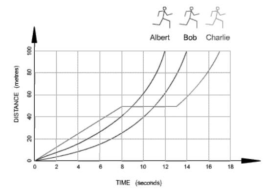
Which runner stopped for a rest?
Albert
Bob
Charlie
Every graph must have a
Pet
Candy bar
Title
Chromebook

What is the name of this graph?
line plot
line graph
bar graph
frequency table
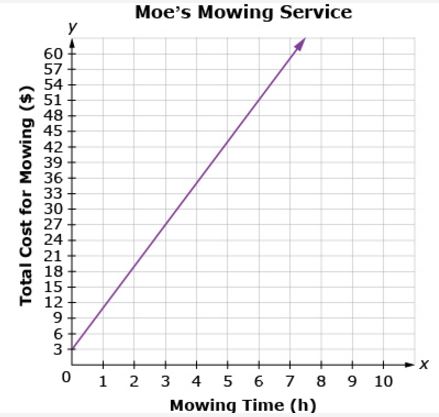
How much does it cost to have your lawn mowed for 2 hours?
$16
$17
$18
$19
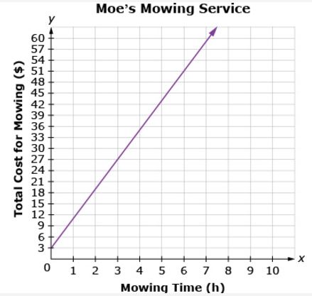
What is the general trend of this line graph?
The more you mow, the less money you make.
You make the same amount of money regardless of how long you mow.
The more you mow, the more money you make.
Mowing is dangerous.
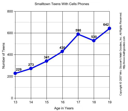
What label is along the y-axis in this graph?
Copyright 2007
Lines
Age in Years
Number of Teens

What is happening at E?
Stationary
Accelerating
Fast steady speed; moving away from the starting position
Steady speed; returning to start position

What is happening at D?
Stationary
Accelerating
Fast steady speed; moving away from the starting position
Slower steady speed; moving away from the starting position

Choose the best graph that describes the statement.
A
B
C
D

How many total people took the survey?
50
150
100
200

What is the dependent variable on the graph (y-axis)?
Metro Bicycle Shop Weekly Sales
Bicycles Sold
Types of Bicycles

What is the independent variable on the graph (x-axis)?
Metro Bicycle Shop Weekly Sales
Bicycles Sold
Types of Bicycles

How many people like cheese pizza the best?
5
10
25
50

How many people like either mushroom or pepperoni the best?
1
20
50
100

How many people have two or less books in their desk?
4
5
6
7

How many people have four books in their desks?
2
3
4
5

