NEW
Font size
 Worksheets
Interpreting Graphs and Charts 2
Total questions: 74
Worksheet time: 2hrs 50mins
About 75% of the Earth's surface is covered by water while the remaining surface is covered by land. Find the percentage of land.
30%
100%
25%
20%

The pie chart shows the percentage of boys in a class. What percentage of the class are girls?
42%
68%
58%
38%

The pie chart shows how pupils of River of Praise School travel to school. What percentage of the pupils travel to school by tricycle?
55%
65%
45%
25%
The pie chart shows how pupils of River of Praise School travel to school. What fraction of the pupils travel to school by motorcycle?
54
254
10016
508
The pie chart shows how pupils of River of Praise School travel to school. Given that 378 pupils travel to school by e-bike, how many pupils are there in the school?
14
100
1400
27

The pie chart shows how Mr Yeo spends his monthly salary. Given that Mr Yeo saves $840 a month, find the amount of money he spends on TRANSPORT.
$600
$1000
$360
$240

The pie chart shows how Mr Yeo spends his monthly salary. Find the percentage for MEALS.
50%
20%
30%
25%

The pie chart shows how Mr Yeo spends his monthly salary. Given that Mr Yeo saves $840 a month, find the amount of money he spends on MEALS.
$600
$1000
$360
$240
The pie chart shows how Mr Yeo spends his monthly salary. Given that Mr Yeo saves $840 a month, find the amount of money he spends on SHOPPING.
$600
$1000
$360
$840
The pie chart shows how Mr Yeo spends his monthly salary. Given that Mr Yeo saves $840 a month, find the amount of money he spends on RENT.
$240
$1000
$360
$840

The pie chart shows the types of animals 60 pupils kept as pets. What FRACTION of the pupils kept FISH?
61
31
103
51
The pie chart shows the types of animals 60 pupils kept as pets. What FRACTION of the pupils kept HAMSTERS?
61
31
103
51
The pie chart shows the types of animals 60 pupils kept as pets. What PERCENTAGE of the pupils kept CATS?
18%
70%
30%
20%
The pie chart shows the types of animals 60 pupils kept as pets. How many pupils kept TERRAPINS?
60
12
10
18

The pie chart shows the mother tongue languages of a class of students. Find the percentage for others.
10%
12%
20%
18%

This is an example of ______________.
pie chart
bar graph
diagram

This is an example of ____________.
line graph
diagram
table

This is an example of _____________________.
pie chart
diagram
table

This is an example of a _________________________ .
line graph
bar chart
pie chart

How many birds are represented by the green sector?
5
20
9
13

The pie chart shows the colours of 32 beads. How many green beads are there?
90
8
11
9

What is the maximum number of computers that someone said they had?
8
10
4
1

What was the most common mode of transport?
Walk
Cycle
Bus
Car
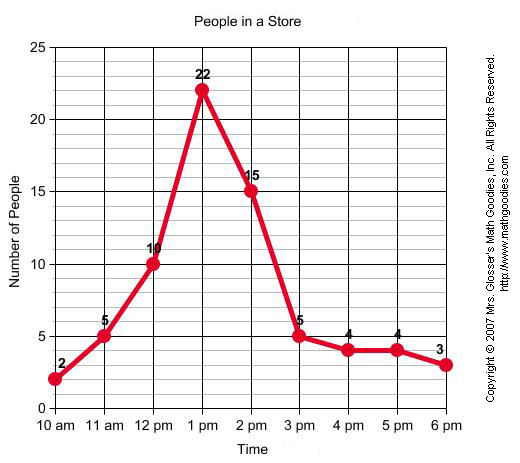

On a small island, scientists kept track of the number of wolves and moose over time. Which trend did they record?
A drop in wolf population and a drop in moose population
An increase in wolf population and a drop in moose population
A drop in wolf population and an increase in moose population
An increase in wolf population and an increase in moose population

According to this chart, which country spent the least money on books in 2004?
Germany
France
Italy
Australia

According to this chart, which appliance is used 8 hours per day on weekdays?
TV
Computer
Fridge
Heater

Which ice cream is most liked by second grade?
Vanilla
Strawberry
Lemon
Chocolate
Peach

Which city has the highest average temperature in August?
Tokyo
New York
Berlin
London

Which day of the week has the most traffic accidents for New York City?
Tuesday
Thursday
Saturday
Sunday

Which continent has 36% of the wild cats?
Asia
Africa
North America
South America

Look at the bar graph, "Nicest Fruit". What does the y-axis show?
Types of fruit
Number of people.
Carey and Justin are raising money to purchase books for the library. The more money they raise, the more books they will be able to purchase for the library.
Which of the variables is dependent?
amount of money raised
number of books

What is wrong with this graph?
The dependent variable is not labeled.
The data that is graphed is incorrect and a different graph should have been used.
The intervals on the x and y axis are written incorrectly.
The color of the graph is not appropriate or professional
What is something on a graph that you have control over and isn't changed by any other variable?
Independent variable
Dependent variable
Controlled variable
Extraneous variable

What kind of graph is this called?
Circle graphg
Line graph
Pie chart
Bar graph
Time such as minutes, days, and months will always be a(n) ________________ variable when graphing.
Controlled
Independent
Dependent
Extraneous

What is the independent variable in this graph?
Tadpoles
Year
Frogs
Number of tadpoles in the pond

What type of variable is the "Price per Bushel (dollars)" in this graph?
Bar graph
Dependent variable
Independent variable
Controlled variable
What type of graph shows change over time?


You want to create a graph that shows your height over a 12-month period. What type of graph will you use? Why?
A line graph because you can put the data points on the graph and see how much you grew over a 12-month period.
Both a line and bar graph would be appropriate because both graphs would be able to show your height over a 12-month period.
A circle graph because we will be able to easily see your height over a 12-month period.
A bar graph because the bars will make it very easy to see how you grow over the months.
Why are graphs and charts important to analyze data?
Graphs and charts are important to analyze data because we would never be able to know what is going on with the data.
Graphs and charts are important to analyze data because teachers say they are important.
Charts and graphs is something good to do because they are nice to look at.
Charts and graphs allow a person to visualize data and find patterns and trends in the data.
What is a dependent variable?
A variable most often found on the x-axis
Dependent variables are only found on pie charts
The variable that changes because another variable changes
The variable the experimenter changes or manipulates
Which type of graph best represents data over a set period of time?
Line
Bar
Table
Circle
What is an independent variable?
Independent variables are only found on pie charts
The variable the experimenter changes or manipulates.
A variable most often found on the y-axis
The variable that changes because another variable changes

What part of this data table will be graphed on the Y-AXIS?
The food cooked
Type of barbecue
The time
The temperature