
 Worksheets
Interpreting Graphs
Total questions: 99
Worksheet time: 4hrs 57mins

How many eggs were measured altogether in this experiment?
25
40
90
100

What type of graph is this?
line plot
line graph
bar graph
frequency table

How many total people took the survey?
50
150
100
200

How many people like cheese pizza the best?
5
10
25
50

How many people have two or less books in their desk?
4
5
6
7

How many people have four books in their desks?
2
3
4
5


How many cans did Third Grade collect?
4 and a half
27
9
5


Look at the Bar Graph, "Student Grades". What grade did the most students get?
A
B
C
D
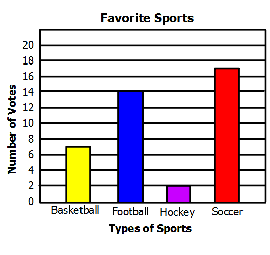

How many students prefer soccer, tennis, and running?
40 students
30 students
25 students
16 students
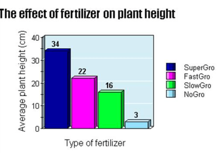
What is the title of this graph?
Type of fertilizer
Average plant height
The effect of fertilizer on plant height
The effect of plant height on fertilizer
What is the independent variable?
Type of fertilizer
Average plant height
The effect of fertilizer on plant height
The effect of plant height on fertilizer
What is the dependent variable?
Type of fertilizer
Average plant height
The effect of fertilizer on plant height
The effect of plant height on fertilizer

What is the BEST title for this graph?
The Relationship between Time Spent Studying and Test Grades
The effect of Time Spent Studying and Test Grades
Time Spent Studying
Test Grades
What is the independent variable for this graph?
The Relationship between Time Spent Studying and Test Grades
The effect of Time Spent Studying and Test Grades
Time Spent Studying
Test Grades
What is the dependent variable for this graph?
The Relationship between Time Spent Studying and Test Grades
The effect of Time Spent Studying and Test Grades
Time Spent Studying
Test Grades
What what type of relationship is displayed in this graph?
inverse (indirect) releationship
direct relationship
no relationship
not applicable

What is the BEST title for this graph?
Discipline Division
Popular Bachelor's Degrees, 1999-2000
Number of Degrees Awarded
The effect of Discipline Division on Degrees Awarded
What is the independent variable for this graph?
Discipline Division
Popular Bachelor's Degrees, 1999-2000
Number of Degrees Awarded
The effect of Discipline Division on Degrees Awarded
What is the dependent variable for this graph?
Discipline Division
Popular Bachelor's Degrees, 1999-2000
Number of Degrees Awarded
The effect of Discipline Division on Degrees Awarded
Which discipline division awarded the most degrees?
Pyschology
Business
Engineering
Education
Visual & Performing Arts
Which discipline division awarded the least degrees?
Pyschology
Business
Engineering
Education
Visual & Performing Arts

What is the best TITLE for this graph?
The effect of missed free throws on wins
The relationship between missed free throws and wins
Number of missed free throws
Number of wins
What is the relationship shown in this graph?
direct relationship
inverse (indirect) relationship
no relationship
not applicable
How does missing free throws impact your team’s chance of winning?
It does not impact it.
Missing free throws decreases the likelihood of winning.
Missing free throws increases the likelihood of winning.
Free throws aren't how you win a game.


What is the IQR of the Cruisers?
4
6
7
5

Calculate the range.
7
5
3
4
8


What is the center of the data?
200
100
90
140
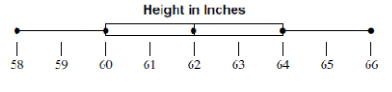

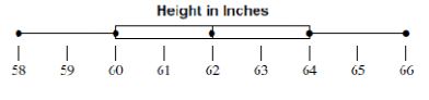
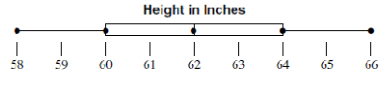
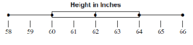
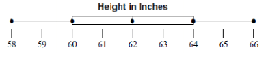
What value is the lower quartile, (Q1)?
66
58
60
64

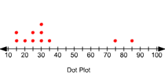
23, 34, 27, 7, 30, 26, 28, 31, 34

How many students scored 93% or less?
6
16
14
13
How many people have four books in their desks?
2
3
4
5
How many people have two or less books in their desk?
4
5
6
7

How many people like either mushroom or pepperoni the best?
1
20
50
100
How many people like cheese pizza the best?
5
10
25
50

What is the independent variable on the graph (x-axis)?
Metro Bicycle Shop Weekly Sales
Bicycles Sold
Types of Bicycles

What is the dependent variable on the graph (y-axis)?
Metro Bicycle Shop Weekly Sales
Bicycles Sold
Types of Bicycles
How many total people took the survey?
50
150
100
200

Choose the best graph that describes the statement.
A
B
C
D

What is happening at D?
Stationary
Accelerating
Fast steady speed; moving away from the starting position
Slower steady speed; moving away from the starting position

What is happening at E?
Stationary
Accelerating
Fast steady speed; moving away from the starting position
Steady speed; returning to start position
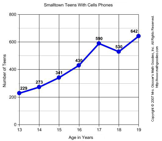
What label is along the y-axis in this graph?
Copyright 2007
Lines
Age in Years
Number of Teens
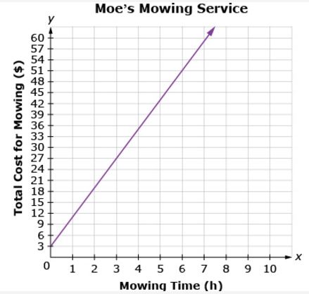
What is the general trend of this line graph?
The more you mow, the less money you make.
You make the same amount of money regardless of how long you mow.
The more you mow, the more money you make.
Mowing is dangerous.
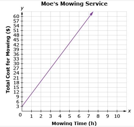
How much does it cost to have your lawn mowed for 2 hours?
$16
$17
$18
$19
What is the name of this graph?
line plot
line graph
bar graph
frequency table
Every graph must have a
Pet
Candy bar
Title
Chromebook
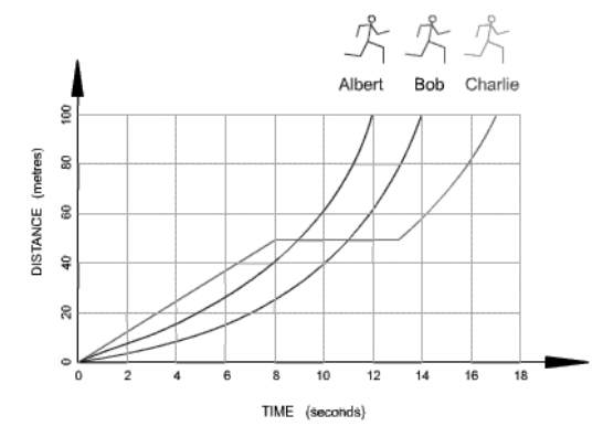
Which runner stopped for a rest?
Albert
Bob
Charlie

Which statement below accurately represents the graph?
$100 is earned for each hour worked
$100 is earned for every 2 hours worked
$500 is earned for every 8 hours worked
$200 is earned for every 3 hours worked
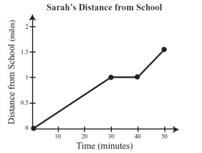
What is happening in the graph between 30 and 40 minutes?
Sarah is accelerating
Sarah is not moving
Sarah is slowing down
Sarah is travelling at a constant speed
How many eggs were measured altogether in this experiment?
25
40
90
100

According to this graph, for every 24 hours, about how many hours are spent watching TV?
0 hours
5 hours
13 hours
3 hours

How many millimetres of rain falls in London in May?
(a)

Which 2 months are the most driest in Manchester?
(a)

Which is the wettest month in London?
(a)

In January, how much more rather is there in Manchester than London?
(a)

How many months does it rain more than 50mm in Manchester and London?
(a)

In December, how much more rainfall is there in Manchester than London?
(a)



In which year did exactly 60 students have scholarships?
2014
2010
2012

What is this graph showing you?
The worlds population has been growing and will continue to grow
The worlds population was growing but now is decreasing
The worlds population is staying the same

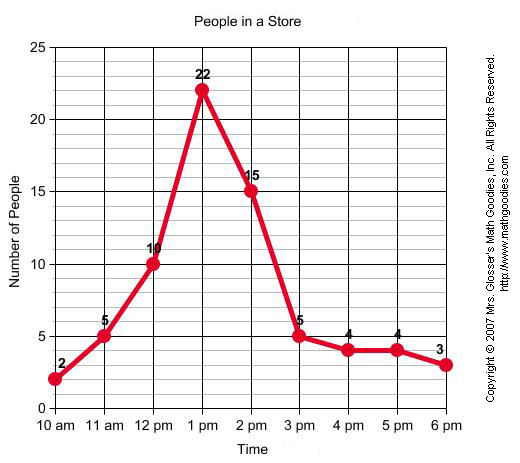
Between which two times was the greatest increase in number of shoppers?
11 AM to 12 PM
1 PM to 2 PM
12 PM to 1 PM

They used their results to make the graph below.
Which month had an average daily temperature of around 41 degrees?
Which runner stopped for a rest?
Albert
Bob
Charlie

What is this graph showing?
The temperature of different volumes of water when boiling
The time it takes for various volumes of water to boil
The change in volume due to temperature change.

Assuming that the population growth of the bacteria continues, what would be a good prediction for the number of bacteria cells that will exist in 140 minutes?
0
40
100
2000

According to this graph, you are most likely to make a basket if you shoot...
Closer to the hoop
Farther from the hoop
2 meters from the hoop
4 meters from the hoop

Mrs. Leffler's class grades were graphed as a pie chart (circle graph). Based on this graph, The largest percentage of students received what grade?
A
B
C
D

What percentage does the entire circle graph represent?
100%
50%
25%
15%

