
 Worksheets
Graphs Test
Total questions: 36
Worksheet time: 20mins
Which type of graph is best for showing changes over time?
A) Bar graph
B) Line graph
C) Pie graph
What does each segment of a pie graph represent?
A trend over time
A different value in a sequence
A proportion of the total
Which of the following is a key feature of a bar graph?
A) Bars of different heights representing values
B) Segments of a circle representing proportions
C) Points connected by lines showing trends
Which of the following is true about line graphs?
A) They can show trends and changes over time.
B) They are used to show parts of a whole.
C) They always use vertical bars.
If a pie chart shows that 'Category A' occupies 25% of the circle, what fraction of the whole does Category A represent?
1/4
1/2
3/4
The Y-axis represents which variable?
Triangular
Independent
Dependent
The X-axis represents which variable?
Dependent
Triangle
Independent
Which type of graph is best for showing the trends in the stock market over the past year?
Bar Graph
Pie Chart
Line Graph
You have data on the percentage of market share held by different companies in a single month. Which graph would best represent this data?
Bar Graph
Pie Chart
Line Graph
You want to compare the sales figures of different products in a single quarter. Which type of graph should you use?
Bar Graph
Pie Chart
Line Graph
Which graph is most appropriate for showing changes in temperature for everyday over the past month?
Bar Graph
Pie Chart
Line Graph
You have data on the proportion of total expenses spent on different categories (e.g., rent, food, utilities) for a month. What is the best graph to use?
Bar Graph
Pie Chart
Line Graph
To visualize the trend in the number of new customers acquired each month over the three past years, which type of graph would be most effective?
Bar Graph
Pie Chart
Line Graph
You want to illustrate the breakdown of a budget into various expense categories as a percentage of the total budget. Which graph should you use?
Bar Graph
Pie Chart
Line Graph
For displaying the trend in the number of visitors to a website over several years, which type of graph is most suitable?
Bar Graph
Pie Chart
Line Graph
You need to show the distribution of survey responses as a whole among different answer options. What is the most appropriate graph?
Bar Graph
Pie Chart
Line Graph
When comparing quantities across different categories, such as the number of books sold by genre, which graph would you use?
A. Bar Graph
B. Pie Chart
C. Line Graph
What is the number of oranges sold at Paige’s Stand?
30
33
27
23
What is the temperature on Thursday according to the given values?
60°F
65°F
70°F
75°F
What percentage of transportation is done by car in a month?
50%
20%
15%
10%
Given the following pie graph data, answer the questions: Pies Sold: Apple 20, Blueberry 40, Cherry 60, Peach 80. What is the total value represented in the pie graph?
200
180
150
100
Given the following pie graph data, answer the questions: Pies Sold: Apple 20, Blueberry 40, Cherry 60, Peach 80. Which category has the highest value?
Apple
Blueberry
Cherry
Peach
Given the following pie graph data, answer the questions: Pies Sold: Apple 20, Blueberry 40, Cherry 60, Peach 80. What is the difference between the highest and lowest values?
20
40
60
80
______________ refers to the min and max numbers used on each axis.
Scale
Grid
Axis
Range
______________ this should be at the top of your graph containing the labels of the x and y axis.
Title
Footer
Legend
Grid
The ________________ is the amount from one value to the next.
Interval
Difference
Gap
Range
Both axes need ____________ so the reader knows exactly what the independent and dependent variables are.
Labels
Titles
Numbers
Units
What does the acronym T.A.I.L.S. stand for?
Title, Axis, Intervals, Labels, Scale
T: Test A: Analyze I: Implement L: Learn S: Succeed
T: Track A: Assess I: Innovate L: Lead S: Solve
T: Train A: Adapt I: Inspire L: Listen S: Support
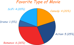
What type of graph is shown?
pictograph
stem and leaf
pie chart
histogram


What type of graph is this?
Bar Graph
Line Plot
Pictograph
Tally Chart
What type of graph is shown?
pictograph
stem and leaf
pie chart
histogram
Which type of graph is most suitable for showing changes over time?
Line graph
Pie chart
Histogram
Scatter plot
Which type of graph is best used to show the parts of a whole?
Line graph
Bar graph
Pie chart
Scatter plot
Which type of graph is best for comparing the frequency of different categories?
Line graph
Bar graph
Pie chart
Scatter plot
Which type of graph is best for comparing the frequency of different categories?
Line graph
Bar graph
Pie chart
Scatter plot

