
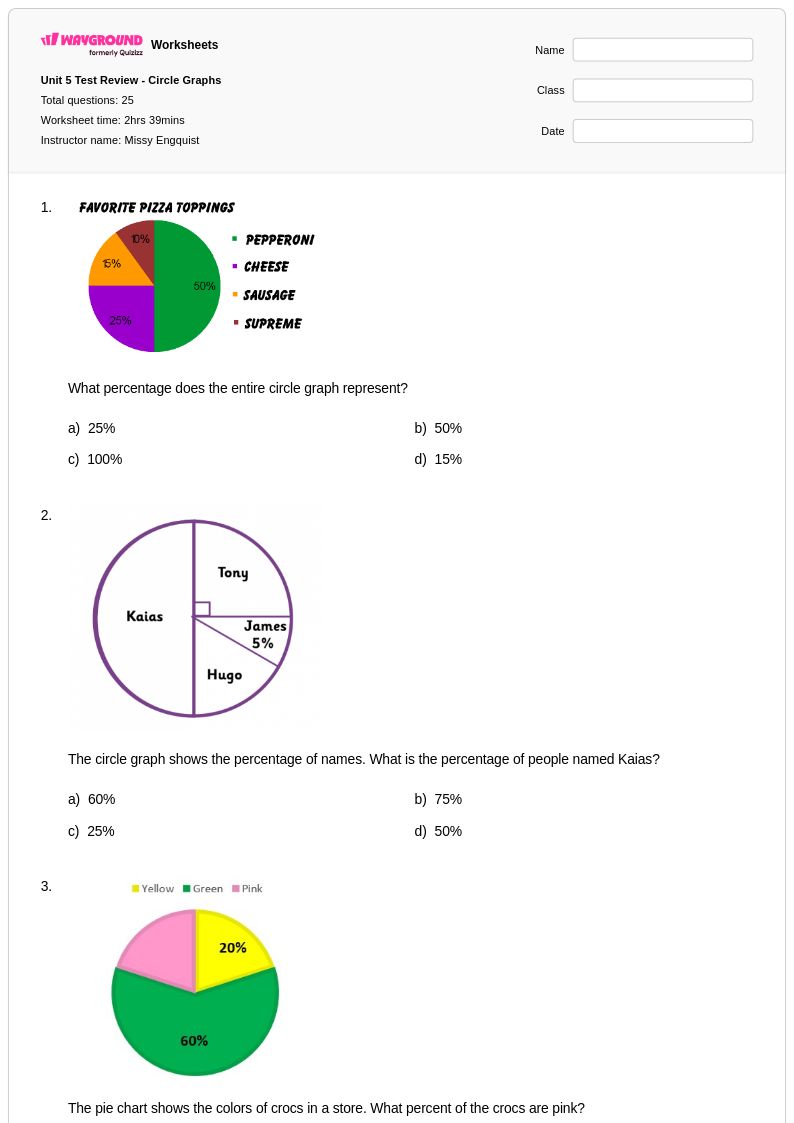
25 Q
6th
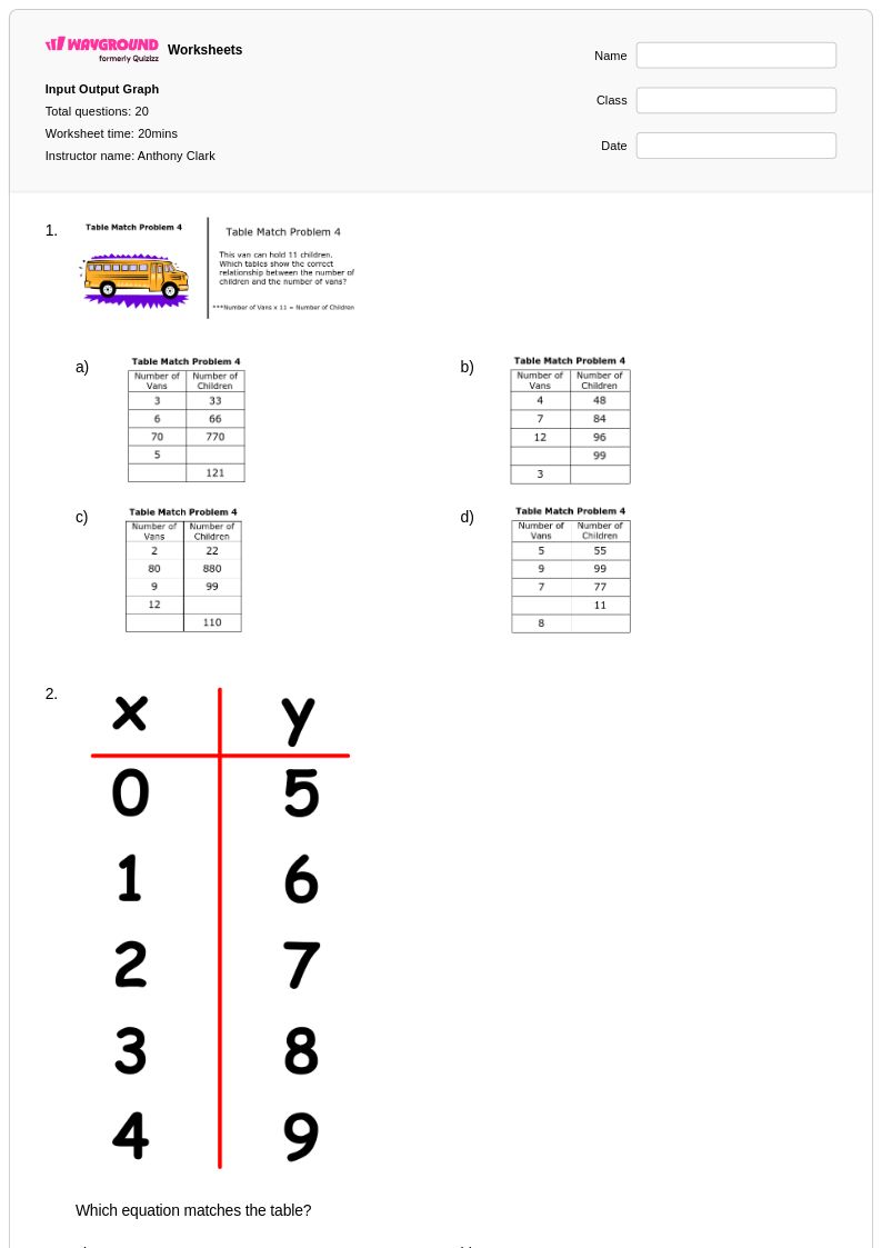
20 Q
5th - Uni
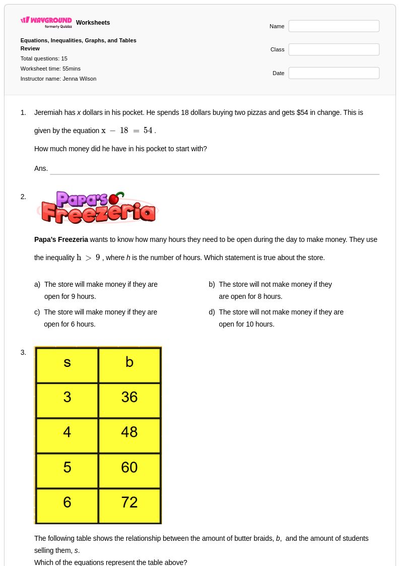
15 Q
6th
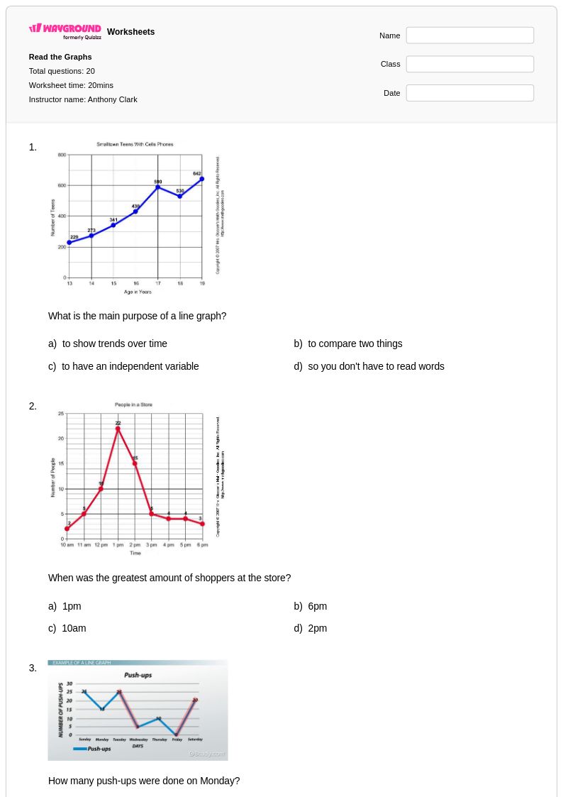
20 Q
5th - Uni
12 Q
6th
20 Q
5th - Uni
20 Q
6th
13 Q
6th - 8th
16 Q
6th - Uni
18 Q
6th - 8th
12 Q
6th
15 Q
6th
20 Q
6th - Uni
10 Q
6th
10 Q
6th - 8th
20 Q
6th - Uni
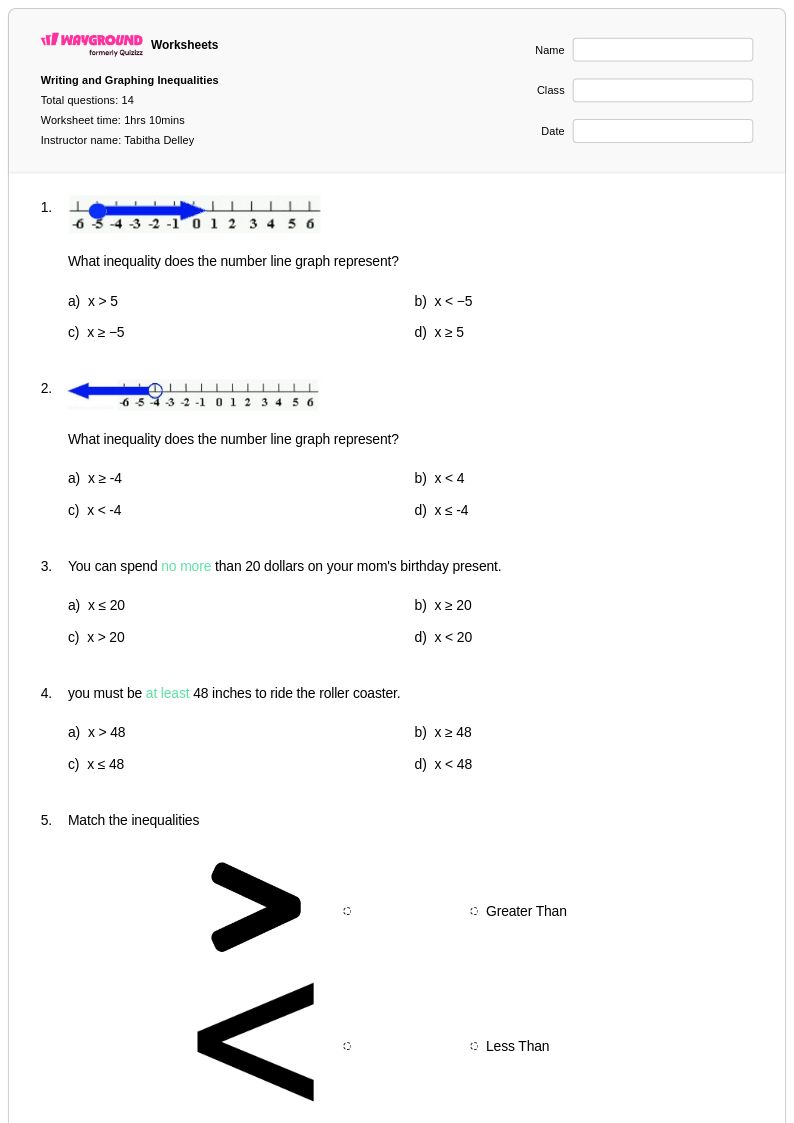
14 Q
6th - 8th
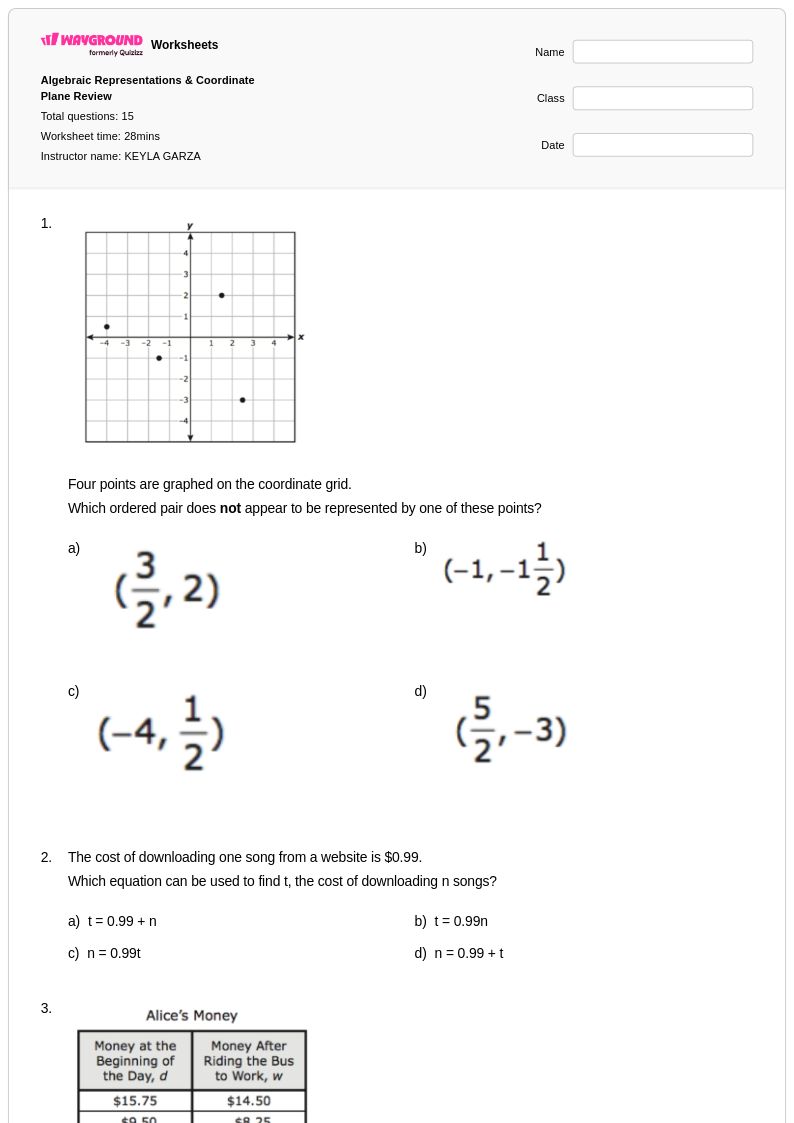
15 Q
6th
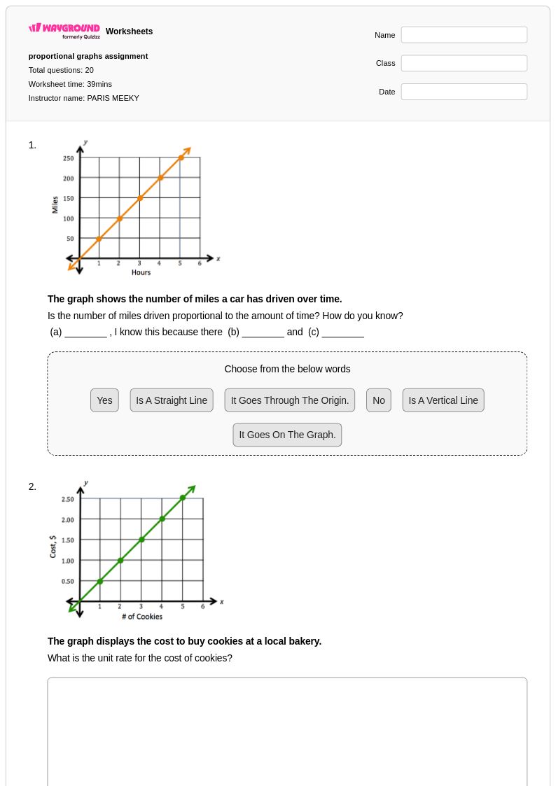
20 Q
6th - 8th
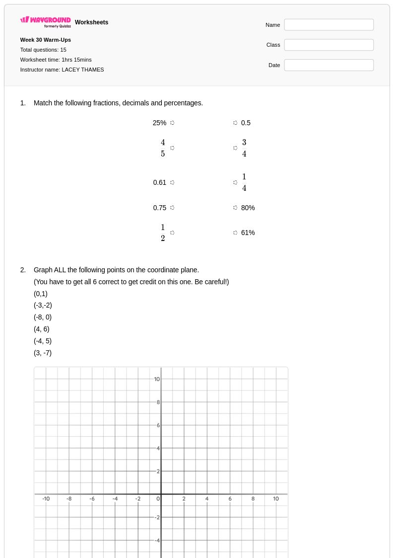
15 Q
6th
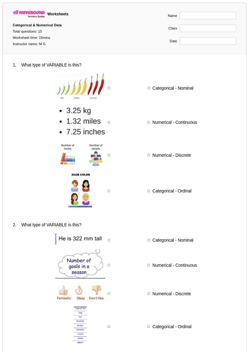
15 Q
6th - 8th
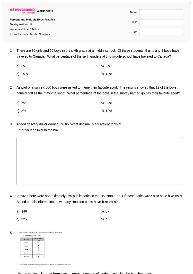
16 Q
6th - Uni
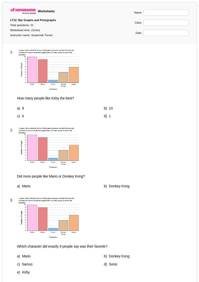
21 Q
6th
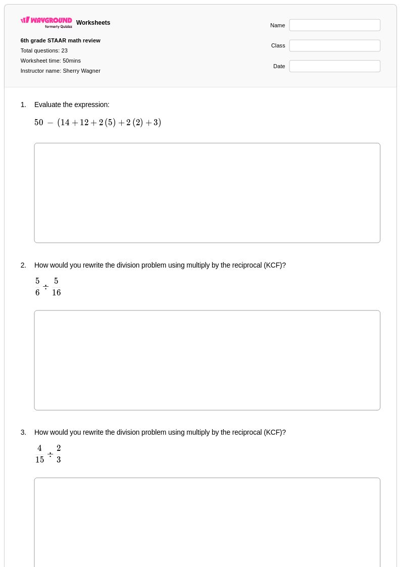
23 Q
6th
Explore Other Subject Worksheets for grade 6
Explore printable Qualitative Graphs worksheets for Grade 6
Qualitative graphs worksheets for Grade 6 students available through Wayground (formerly Quizizz) provide comprehensive practice in interpreting and analyzing non-numerical data representations. These educational resources strengthen critical thinking skills by teaching students to read and understand graphs that display categorical information, trends over time, and comparative relationships without specific numerical values. The worksheets feature diverse practice problems that challenge students to extract meaningful information from line graphs showing general patterns, bar charts displaying qualitative comparisons, and pictographs representing survey data. Each printable worksheet includes detailed answer keys that help students verify their interpretations and understand the reasoning behind correct responses, making these free resources invaluable for developing data literacy skills essential in mathematics and real-world applications.
Wayground (formerly Quizizz) empowers educators with an extensive collection of teacher-created qualitative graphing resources drawn from millions of available materials designed specifically for Grade 6 mathematics instruction. The platform's robust search and filtering capabilities enable teachers to locate worksheets aligned with specific curriculum standards while accessing differentiation tools that accommodate diverse learning needs within the classroom. These customizable resources are available in both printable pdf formats for traditional paper-based instruction and digital formats for technology-integrated lessons, providing flexibility for various teaching environments. Teachers utilize these comprehensive worksheet collections for targeted skill practice, remediation sessions with struggling learners, enrichment activities for advanced students, and strategic lesson planning that builds students' confidence in interpreting qualitative data representations across multiple mathematical contexts.
FAQs
What types of graphs are introduced in 6th grade?
What is the difference between a bar graph and a histogram, and how do I teach it?
What exercises help 6th graders analyze the shape and spread of data on a graph?
How does 6th-grade data analysis connect to statistics?
What are common difficulties for 6th graders when learning about statistical graphs?
How can I support diverse learners with these more complex graphs?
How can I use this 6th-grade graphing worksheet?